
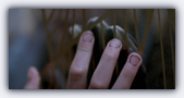
When designing this site, I used the following image as my guide for its visual style. This image was used as a cut scene in the film:

I was inspired by the way that Hoyte Van Hoytema, the cinematographer on Let The Right One In, lit and shot his exterior night scenes. It seems that he lit them with some very bright lights suspended very high above the scene. This resulted in a dim, diffuse light that seemed to cast few shadows in the lit areas, which seem to be awash in silvery moonlight. However, outside the lit areas the visual field faded very rapidly to near black. These scenes also seem to be shot with a neutral density filter, which in combination with the dim light tend to wash out most colors. This made these scenes look cold, it made them look lonely and isolated. It made the world look to us as it must have felt to Oskar and Eli.
For me this was typified by the cut scene shown above. I took my color palette from those that I could see in this cut scene when I closed my eyes to slits and squinted at it until it blurred out of focus. Thus most of the content on this site uses no bright colors. It is set against a sickly white background that fades out to dark at the edges. I wanted this site to look as cold and lonely as Van Hoytema’s beautiful cinematography.